Insights
Of Italy’s 7,899 municipalities, 51.4% face at least one high hazard among landslides, floods and earthquakes. The analysis, based on data from ISPRA and the Civil Protection Department, shows that each hazard follows its own geography: earthquakes weigh on people, landslides on small municipalities in inner areas, floods on plains and cities. And among the 1,130 municipalities with fewer than 5,000 inhabitants exposed to landslides, 190 have no slope stabilisation project at all.
Combining landslides, floods and earthquakes into a single index would be misleading: the three hazards have different causes and geographies, and a single value would hide precisely the information needed by those planning to make the territory safe. For each municipality, the analysis therefore looks at which hazards exceed a high threshold, using data from ISPRA (Italian Institute for Environmental Protection and Research) and the Civil Protection Department:
Hazard is not the same as risk. In ISPRA’s definition, hazard is the probability that a potentially destructive event of a given intensity occurs in a given area within a given period of time; risk is the expected damage, which also depends on the vulnerability and exposure of people and assets. This analysis measures hazard.
Overall, 3,133 municipalities face high seismic hazard, 1,280 high landslide hazard and 719 high flood hazard. The picture changes, however, depending on whether municipalities or people are counted. Among municipalities exposed to a single hazard, earthquakes affect 2,200, with 22.2 million residents, 37.5% of the population; landslides alone affect 516 municipalities but just 1.2 million inhabitants, because they hit small towns; floods alone affect 330 municipalities with 3.7 million inhabitants, because they occur in plains and cities.
An indicator built on residents and one built on municipalities therefore lead to different orders of priority. Choosing which one to use is already a planning choice: making it explicit makes it defensible. The maps below show the starting point for both readings: the municipalities exceeding the high-hazard threshold, hazard by hazard.
The hazards overlap less than one might expect. No significant link emerges between floods and earthquakes, and the shares of residents exposed to landslides and to floods move almost independently, with a correlation of +0.08. Only 60 municipalities face all three hazards.
Treating an area as generically fragile risks directing the same type of intervention towards municipalities with different needs. This is why the series looks at the three hazards one at a time, starting with landslides.
The 1,280 municipalities exposed to landslides share a clear profile: 75.2% are in inner areas and 88.3% have fewer than 5,000 inhabitants. It is a hazard spread across many small local authorities rather than concentrated in a few populous centres.
The share of municipalities exposed to landslides falls from 26.5% among those with fewer than 1,000 inhabitants to 2.7% among those with more than 20,000; for floods the trend is the opposite, from 6.4% to 12.4%. The result: municipalities with fewer than 5,000 inhabitants are home to 16.5% of Italians but to around 42% of those living in landslide areas.
The hazard is therefore concentrated in local authorities that, because of their size, generally have smaller technical departments. Here, the capacity to design an intervention and report on it matters as much as the availability of resources.
Of the three hazards, landslides and earthquakes are the only pair that tends to go together: 53% of municipalities exposed to landslides are also exposed to earthquakes, compared with 40% of Italian municipalities overall, and the correlation between the shares of exposed residents rises to +0.27. Of the 60 municipalities facing all three hazards, about two thirds are in two regions, but the phenomenon is not confined to the South:
Almost all of them are small municipalities (the largest, San Felice a Cancello, has 16,963 inhabitants) and 60% are in inner areas. For these local authorities, the point is to try to bring together interventions of different kinds within the same programme: slopes, the drainage network, buildings.
To check whether projects reach the places where they are needed, three datasets were cross-referenced: cohesion policy projects, projects under the NRRP (National Recovery and Resilience Plan) and the works recorded in the public works monitoring system (MOP). The scope matters: the absence of a project in these sources means that the municipality does not appear among the recorded beneficiaries, not that no intervention is being carried out in its area, because works funded through other channels or classified differently may not be captured.
Of the 1,130 municipalities with fewer than 5,000 inhabitants exposed to landslides, 940 (83.2%) have at least one slope stabilisation project in the sources considered, while 190 (16.8%) have none.
The uncovered municipalities are concentrated in four regions, which together account for 130 of them: Piedmont (58), Liguria (27), Tuscany (26) and Aosta Valley (19). Relative to the number of exposed municipalities, the uncovered share is 38% in Tuscany, 37% in Aosta Valley, 36% in Liguria and 33% in Piedmont; in Campania, by contrast, every exposed municipality has at least one project.
Coverage does not mean adequacy: the presence of a project does not show whether the intervention is proportionate to the exposure. And the regional share is a summary indicator, while the 190 municipalities form a named list: the scale that matters for decisions remains the municipal one.
Territorial fragility cannot be read through a single number, and for landslides the scale that matters is that of the individual municipality. The data suggest three readings:
Bringing these indicators into the DUP (Single Programming Document) means using data to explain why one intervention is scheduled before another. When facing an oversight body or the public, it is the difference between a stated priority and a demonstrable one. What counts is which hazard, not how many. The next chapters of the series will apply the same reading to floods and earthquakes.
Since the 2025 Budget Law, municipalities have been required to freeze a share of current spending in their budgets. At year-end that amount becomes investment capacity for the following financial year, and it must be used before taking on new debt.
Law No. 207 of 30 December 2024 sets an order of priority among funding sources. The resources set aside as the contribution to public finance targets, namely the contribution that each municipality enters in its budget in a dedicated fund, once they have flowed into the administrative result, finance the following year’s investments before any recourse to new debt.
Take the example of a municipality that sets aside the contribution and closes the financial year with a non-negative result. The following year, if a school roof needs to be replaced, the municipality must first use the share earmarked for investment, provided it can actually be applied to the budget, and consider a loan for any remaining funding gap. This changes both the amount the council must authorise and the interest paid in subsequent years.
The budget balance rule therefore requires municipalities to achieve a non-negative balance between accrual-basis revenues and expenditures, that is, revenues assessed and expenditures committed during the year. The calculation includes the use of the administrative surplus, the recovery of the deficit and the use of the multi-year restricted fund (FPV); restricted and set-aside revenues not used during the year are excluded.
This is a tighter constraint than the one in force since 2019 (Law 145/2018, paragraph 821), which was considered met with a non-negative accrual result: the balance must now be calculated net of unused restricted and set-aside resources. The amount to be set aside by municipalities in ordinary-statute regions, Sicily and Sardinia totals €130 million in 2025, €260 million a year from 2026 to 2028 and €440 million in 2029; each municipality’s share is set by ministerial decree.
The check is carried out on municipalities as a whole, but the consequences fall on individual authorities. Every year from 2026 to 2030, by 30 June, a decree of the Ministry of Economy and Finance verifies the balance and the set-asides across all municipalities, based on the year-end financial statements submitted to the Public Administration Databank (BDAP). Negative deviations by some authorities are offset by positive ones by others.
If the sector as a whole is compliant, nothing happens. If it is not, the correction applies only to the authorities that failed to meet the balance or did not make the set-aside: within thirty days they must increase the fund by an amount equal to the negative balance plus the missing share. For them it is an unplanned budget variation, which forces a quick decision on which commitments to postpone.
The new budget templates apply from the 2026-2028 budget, and therefore also to the 2027-2029 budget now being prepared. The contribution does not need to be estimated, because the amount is already fixed. The municipality only decides which current resources to cover it with, and the room for other recurring expenditure shrinks.
The amounts are fixed until 2029 and the 2026 Budget Law did not change them. One financial year passes between the year of the set-aside and the year in which the amount finances works: the works timetable included in the DUP, the Single Planning Document, must take this into account. For an authority in deficit, the amount does not finance works but speeds up the recovery of the deficit.
The municipal executive (giunta) prepares the draft and submits it to the council by 15 November, together with the update note to the DUP. The council approves it by 31 December, covering a period of at least three years. The deadline can be extended by decree of the Minister of the Interior, as has happened in each of the last three years, under Articles 151 and 174 of the TUEL, the Consolidated Law on Local Authorities.
The Single Planning Document is the authority’s strategic and operational guide. It has a strategic section, covering the term of office, and an operational section, covering the budget period. The executive submits it by 31 July and updates it in November. Without the DUP the budget cannot be approved. Municipalities with up to 5,000 inhabitants use a simplified version (Article 170 of the TUEL).
No. EU rules set a net expenditure growth path for the national public sector as a whole, not for individual authorities. The constraint on the balance and on the set-asides stems from the Italian Budget Law, while the national accounting framework has yet to be aligned with the new EU rules.
No. The municipality enters in its budget, under Mission 20 (Funds and provisions), a current-account fund equal to the contribution, which cannot be committed. It does not reduce the Municipal Solidarity Fund. At year-end the fund becomes a spending saving: for authorities in deficit it contributes to early recovery of the deficit; for the others it finances the following year’s investments. Law No. 207 of 2024, Article 1, paragraphs 789 and 790.
No. The check covers municipalities as a whole, but the correction falls only on those that failed to meet the balance or did not make the set-aside. There is also a separate penalty: the contribution increases by 10% for authorities that do not submit their final or pre-final accounts data by 31 May. Law No. 207 of 2024, Article 1, paragraphs 792 and 793.
Exempt are authorities that were in financial distress (dissesto) or under a financial rebalancing procedure as at 1 January 2025, and those that signed the deficit recovery agreements provided for by Law No. 234 of 2021 and Decree-Law No. 50 of 2022. Law No. 207 of 2024, Article 1, paragraph 784.
An analysis of the 2023-2026 data from the MIM (Ministry of Education and Merit) reveals that the way students reach school varies drastically from one area to another, and that the true missing infrastructure is not the schools themselves, but the roads leading to them.
The school that is most difficult to reach is not necessarily the most isolated one. By cross-referencing the Ministry's registry with the SNAI classification of municipalities, the geography of accessibility shifts, and with it, the priorities for where to invest in school transportation.
Counting schools in absolute terms is misleading. Cities, with more institutions and more students, will inevitably have higher numbers, but this does not necessarily make them the most accessible. To measure real access, we must look at the available modes of transport: urban public transport, school buses, cycle paths, and transport for students with disabilities. This set of indicators is at the heart of the analysis conducted on the 63,104 Italian schools.
The picture that emerges is far from uniform, and it is not just a matter of individual regions: the share of schools in remote areas follows a clear gradient by macro-area. In the Islands, it is 28.4%, in the South it is 19.0%, dropping to 9.5% in the Center and just 7.0% in the North - a ratio of almost 4 to 1 between the extremes. Nationally, 34.4% of schools are located in cities, 52.2% in intermediate centers, and 13.4% in remote areas, but the real difference is not how many schools there are, but how small and scattered they are: a primary school in a remote area has an average of 92 pupils, compared to 181 in cities.
Within this geographical framework, transport tells an equally clear story. Comparing the three SNAI contexts (cities, intermediate hubs, and remote areas) reveals an almost mirror-image relationship: in cities, 78.5% of schools have public urban transport, but only 48.9% have a school bus; in remote areas, the opposite is true, with just 50.2% served by urban transport, while 76.7% are covered by school buses.
The trend is clear: as scheduled public transport decreases, school bus provision increases. However, this is not always a full compensation: bike lanes do not follow the same recovery pattern and remain an almost exclusively urban infrastructure (12.7% in cities versus 3.1% in remote areas).
Three regions illustrate the dynamics at play with particular clarity, and they are not all where one might expect:
● Sicily: 27.8% of schools are in remote areas, more than double the national average (13.4%). The island's mountainous terrain explains the high fragmentation of school services in the hinterland.
● Calabria: with 22.5% of schools located in remote areas, it confirms that this phenomenon is not an isolated exception but a structural issue affecting the South and the Islands.
● Trentino-Alto Adige: 37.6%, the second-highest rate in Italy after Basilicata and Molise, driven by the province of Bolzano (47.4%). This is proof that educational isolation is not just a phenomenon of the South: the Alpine landscape produces the same effect in the North.
The data tell an interesting story, but they require cautious interpretation on two distinct fronts. First, the percentage of school buses does not automatically imply a service quality equivalent to scheduled public transport: frequency, timetables, and territorial coverage remain variables that these indicators do not capture. Second, a synthetic accessibility index calculated at the municipal level increases similarly with both urban transport and school buses without clearly distinguishing between them; a preliminary correlation analysis does not allow us to use it as independent confirmation of the compensation relationship described above. Therefore, we treat it as purely descriptive data (2.62 in remote areas versus 3.46 in cities) rather than as evidence supporting the thesis.
It is not enough to count schools; we must look at how students reach them.
Counterintuitively, the regions with the largest mountainous areas are not those with the most schools with low accessibility (defined as lacking both urban public transport and school buses): the correlation between the two variables, calculated across the 19 regions for which data is available, is negative (r = -0.51). Valle d'Aosta, Molise, and Abruzzo - among the most mountainous territories in Italy - have some of the lowest shares of schools with low accessibility. Campania, by contrast, despite having a territory that is on average less mountainous, records the highest share overall (32.7%) — nearly double that of any other region. The geographical factor alone is not enough to explain where the school transport system is failing: local investment choices likely matter more.
Macro-areas and the transport chart tell the same story from two different angles. The former shows where the phenomenon of inland areas is structurally concentrated, while the latter indicates how the response changes in terms of available means of transport. The result is an insight that must be handled with care: it is not enough to simply count schools; one must look at how students reach them. Those planning investments in school transport should calibrate their interventions based on the mix of available transport in each territory—and keep in mind that educational isolation is not just a problem in the South, as the case of Trentino-Alto Adige demonstrates.
The most dangerous Italian municipality for road safety is not necessarily the one with the highest absolute number of accidents. When accidents are measured against the number of registered vehicles, the geography of risk shifts, as do the priorities for intervention. However, some of the more visible clusters on the map require a more careful analysis before they can be used as criteria for action.
Counting road accidents in absolute terms is misleading. Larger cities, with more traffic and more vehicles, will inevitably report higher figures - but this does not necessarily make them the most dangerous. To measure actual risk, the unit of measurement must change: not crashes in absolute terms, but crashes per registered vehicle. This is the indicator at the centre of the analysis carried out on Italian municipalities for the 2022–2023 biennium: average annual accidents per 1,000 registered vehicles in each municipality.
The resulting map is far from uniform. Road risk is not evenly distributed across the peninsula, nor within regional boundaries: geographically adjacent municipalities can record very different accident rates. The highest concentrations are found along certain stretches of central and northern Italy, while large parts of the territory record more contained values. This fragmented picture suggests that local variables - infrastructure quality, tourist flows, urban density, and mobility patterns - play a decisive role in defining the road risk profile of each area. The crash rate per registered vehicle draws a clear geography: in the municipal map below, light blue identifies the lowest values, while darker shades indicate municipalities with higher accident rates relative to their vehicle fleet.
Behind the accident risk map, a recurring element emerges: the share of motorcycles in the total vehicle fleet. The regional comparison shows that the greater the prevalence of two-wheelers, the higher the accident rate per vehicle. The trend is unambiguous: in the chart, the bubbles representing each region rise as the motorcycle share increases.
The bubbles in the chart follow a clear direction. The further right one moves - towards regions where two-wheelers account for a larger share of the vehicle fleet - the higher the data points: where more motorcycles and scooters circulate, accidents per vehicle are more frequent. The relationship is clearly visible. However, caution is warranted: the share of motorcycles in the registered vehicle fleet is certainly a key statistical indicator to keep in mind, but it does not imply a direct causal relationship. Accident rates are the product of multiple intertwined factors: urban density, road conditions, traffic seasonality, climate, and driving behaviour.
Three regions illustrate the dynamics at play with particular clarity:
The data tells an important story but requires interpretive caution. Some accident concentrations are also connected to infrastructural, economic, and tourism-related dynamics that the simple accidents-to-vehicles ratio cannot isolate.
One key factor is the presence of major high-speed national roads. According to ISTAT 2023 data, extra-urban roads account for 48.4% of total fatalities while representing only 21.4% of all accidents, with a mortality rate of 4.1 deaths per 100 accidents - nearly four times that of urban roads. This differential is not evenly distributed: it accumulates along major arterial roads running through small and medium-sized municipalities.
The map and the chart tell the same story from two different angles: the former shows where risk is geographically concentrated; the latter points to a characteristic that accompanies it - the prevalence of two-wheelers. The correlation between the diffusion of two-wheelers and the accident rate per vehicle is real and visible in the municipal data. The takeaway is one to handle with care: what matters is not only how many vehicles circulate, but which types. Regions where motorcycles are more common consistently record higher accident rates: those planning road safety interventions (such as motorcycle and bicycle infrastructure, enforcement, or prevention campaigns) should weigh the composition of the local vehicle fleet, not just traffic volume.
Explore these and other insights on Italian municipalities through the Territorial Analysis module.
Series: Scenarios — Italy after the NRRP | Article 1
When the PNRR closes, emergency-mode EU funding ends with it. The tight deadlines, fast-tracked reporting and top-down priorities give way to ordinary, structural, multi-annual programming. But does Italy's public administration have the spending capacity to make it work?
When the National Recovery and Resilience Plan (PNRR) officially comes to an end on 31 August 2026, Italy will find itself facing an uncomfortable reality. For four years, the €194.4 billion made available through the Plan have masked a structural weakness that the country has yet to address.
According to the Seventh Report to Parliament on the State of PNRR Implementation published by the PNRR Mission Structure in January 2026, as of 30 November 2025, actual expenditure incurred by the responsible public administrations amounted to €101.3 billion: 52% of the allocated resources, compared with €153.2 billion already disbursed by the European Commission, representing 78.8% of the total.
But what remains available, and what opportunities lie ahead? The 2021–2027 Structural Funds still offer significant room for action. With €75 billion in European funding and national co-financing - the ERDF, ESF+, JTF and EMFAF allocation provided under the Italy 2021–2027 Partnership Agreement - and with the first expenditure certification deadline of 31 December 2025 already exceeded (Italy certified €8.9 billion, surpassing the EU target of €3.6 billion), local public administrations are now entering the most demanding phase of the programming cycle, with final reporting due by 2030. Several regions, particularly in Southern Italy, have already accelerated the implementation of ERDF and ESF+ programmes to offset the gradual phase-out of the PNRR. This is an encouraging sign, although the administrative capacity to turn commitments into completed projects remains the main bottleneck.
Negotiations in Brussels on the next 2028–2034 Multiannual Financial Framework (MFF) are already well underway. The European Commission presented its proposal in July 2025, and Italy is actively participating in discussions between the so-called frugal countries—which support redirecting resources towards defence and strategic capabilities - and highly indebted countries such as Italy, Spain and several Eastern European Member States, which continue to defend cohesion policy as a key instrument for promoting European convergence.
In this context, the end of the PNRR is not simply the loss of an extraordinary funding instrument: it is also a test of maturity for the Italian public administration. Italy’s negotiating credibility in the 2028–2034 MFF will depend on its demonstrated ability to effectively manage and spend the ordinary 2021–2027 Structural Funds, rather than on the PNRR itself, which concludes as a standalone instrument. If Italy successfully certifies expenditure and completes the planned reforms, it will have a stronger voice in shaping the rules of the next 2028–2034 cohesion policy cycle.
For municipalities, provinces and regions, the challenge is twofold. They must absorb the €75 billion available through the 2021–2027 Structural Funds within tight deadlines. This represents a critical test for a country that, during the 2014–2020 programming period, met its expenditure targets only thanks to a final-year acceleration, certifying €10.5 billion out of the total €47 billion in the last eligible year, under the pressure of the automatic decommitment rule, which requires unspent EU funds to be returned to Brussels. At the same time, they must do so within the constraints of the reformed Stability and Growth Pact, adopted in 2024, which requires highly indebted Member States to achieve a minimum annual structural adjustment of 0.5% of GDP. ANCI has already raised its concerns, calling for no additional quantitative restrictions on municipal budgets, particularly regarding public investment and social expenditure. The paradox is clear: local public administrations are being asked to do more with fewer resources.
Are we heading towards stagnation? It is too early to say, but the projections of the most authoritative institutions converge on a scenario of sluggish growth.
In its latest June 2026 projections, the Bank of Italy forecasts Italian GDP growth of 0.5% in 2026, 0.4% in 2027, and 0.9% in 2028, revising its December 2025 estimates downward by around half a percentage point. The revision is mainly driven by rising energy prices linked to the conflict in the Middle East. ISTAT, in its June 2026 report, is more optimistic, forecasting 0.7% growth in both 2026 and 2027, supported by domestic demand despite the negative contribution of net external demand, also affected by the conflict in the Middle East and higher energy costs.
The most critical issue is the investment gap that the PNRR leaves behind.
According to Bruegel's 2024 estimates, the green and digital transition alone requires the European Union to mobilise at least €481 billion in additional investment every year until 2030—not a cumulative figure, but a recurring annual investment need on top of already planned spending.
However, the Draghi Report (September 2024) broadened this estimate, raising the annual requirement to €750–800 billion in additional investment to ensure Europe's competitiveness, energy transition and defence capabilities. Italy has also used the Recovery Fund as a substitute for a public investment policy that has remained weak for decades. Without that lever, the risk is not only slower growth, but also the country’s inability to continue modernising.
In the next article, Civiqa will examine the issue of administrative capacity: how many Italian municipalities actually have the expertise needed to manage the Structural Funds? What are the main challenges in the reporting process, and how can they be addressed? What are the differences between Northern and Southern Italy? As we will see, the figures are even more concerning than the GDP forecasts.
Between 2003 and 2024, NASA satellites measured the surface temperature of each of Italy's 7,899 municipalities. Comparing the five years from 2020 to 2024 with the decade from 2003 to 2012, 98.6% of municipalities are hotter during the day, with a national average shift of +0.61 °C. This is not a ranking of one area against another: it measures how much hotter each place has become than it used to be.
When discussing global warming, the most common habit is to compare different regions: mountains are cooler than plains, and the South is warmer than the North. This exercise primarily measures geography and ends up confirming the obvious. This analysis asks a different question: how much has each municipality warmed compared to the climate that same area experienced at the beginning of the century? Comparing a place with its own history eliminates factors that do not change over time, such as altitude, latitude, or proximity to the sea, because they appear identical in the two periods being compared and cancel each other out in the difference. The starting data is surface temperature – asphalt, roofs, soil – detected by satellites, not the air temperature from weather stations.
Map 1 shows a country warming almost everywhere: 98.6% of municipalities show a positive daytime deviation, with a national average of +0.61 °C and peaks exceeding one degree. The usual distinction between a temperate North and a scorching South no longer exists. The most rapid warming is concentrated in the Po Valley, inland and southeastern Sicily, Salento, and along the Western Alps; the most moderate deviations are found in the inland areas of Central Italy and in Sardinia. A useful clarification for correctly interpreting the data: the darker shades do not indicate the hottest places in absolute terms, but those that have deviated the most from their own climatic history. An Alpine municipality can therefore show a higher deviation than a Sicilian one, while remaining much cooler in absolute terms. Areas with a slightly negative deviation (very rare) account for just over one municipality in a hundred.
When municipalities are divided into five homogeneous groups (quintiles) based on their tree cover, the average daytime temperature deviation consistently decreases as greenery increases: from approximately +0.8 °C in the least wooded quintile to about +0.5 °C in the most wooded one. This same pattern is observed when comparing municipalities within the same province, where regional climate and context remain constant. In the Pavia area, Brallo di Pregola, which is nearly 90% forested, warmed by +0.41 °C, compared to +1.84 °C in the nearly barren Semiana, in Lomellina. In the L'Aquila area, Fagnano Alto, with over 70% tree cover, remains at +0.07 °C, essentially at its norm, while Santo Stefano di Sessanio, with 6% tree cover, has risen by +1.31 °C. In the Brindisi area, Ceglie Messapica, which is nearly three-quarters covered, shows +0.41 °C against +1.69 °C in Torchiarolo, which is less than 10% wooded. The gap between the least and most wooded municipalities widens as you move down the Peninsula: about four-tenths of a degree in the Center and South, and less than three-tenths in the North.
Two limitations should be kept in mind. The analysis is descriptive and associative, not causal: it does not isolate other territorial factors, such as land use, irrigation, and morphology, which contribute to the result alongside tree cover. Furthermore, the documented benefit applies only to the daytime: at night, the correlation between trees and temperature deviation changes sign (+0.30), and nights are warming almost twice as much as days, by an average of +1.03 °C, with all municipalities above their norm. This is the most critical dimension and the one least manageable through urban greenery alone.
The final part of the analysis identifies the areas where current heat is most dangerous for the elderly population by combining the absolute summer surface temperature from the 2020-2024 five-year period—weighted toward the nighttime component, the primary factor associated with heat-related mortality—with the percentage of residents over 75. The two dimensions combine multiplicatively: a municipality that is scorching but demographically young, or one that is very elderly but cool, does not generate a high level of risk.
At the provincial level, the highest values are recorded where a warm climate and an aging demographic structure overlap: Livorno, Oristano, Terni, Grosseto, and Lecce top the list, while the entire Alpine arc, from Bolzano to Sondrio, Trento, Aosta, and Belluno, ranks at the bottom. At the municipal level, the 77 most extreme cases (1% of the total) are concentrated, with 65 occurring in the South and the Islands: small towns in the Ionian Calabria, Salento, inland Sardinia, and the Sicilian hinterland. This map does not align with tree cover: trees mitigate heat, but the elderly population resides disproportionately in the most wooded rural villages, where depopulation has left behind the most vulnerable residents. The index measures the exposure of the average inhabitant, not the number of people exposed; this is particularly relevant in large cities, where the elderly are numerous in absolute terms but represent a small percentage of the total population.
The data point to two distinct levers. The first concerns tree cover, the only observed variable that an administration can directly influence, and whose benefits for daytime heat are well-documented: increasing it in municipalities with fewer trees produces a measurable effect, even if it cannot be quantified as a direct causal reduction in warming. The second concerns the nighttime component, which is the most critical for health and cannot be mitigated by greenery alone: here, local planning must focus on climate relief facilities, monitoring the elderly population, and organizing services during periods of highest risk. The combination of climatic danger and demographic vulnerability suggests that intervention priorities do not necessarily coincide with the hottest municipalities overall, but rather with those where these two conditions overlap. The availability of these indicators at the municipal level, developed on Civiqa, allows local authorities to anchor their programming and service planning to the actual territorial situation, rather than to regional or national averages.
In Italy, millions of unoccupied homes represent a significant, underutilized real estate asset. Understanding how to leverage this socially and economically first requires understanding the social and economic makeup of these areas. Data clearly shows that this isn't merely a problem of a dysfunctional real estate market; behind these vacant properties lies a silent transformation in the structure of Italian families.
A municipality with many empty houses tells a story. First, it indicates that its population has declined and that there isn't a thriving economy because family sizes have decreased.
To understand how to re-evaluate the housing stock as a resource, it's not enough to know the absolute number of unoccupied dwellings. This number naturally increases with the size of the municipality, where the building stock is larger by definition. What's needed is an indicator that measures proportion, not quantity – specifically, the rate of unoccupied dwellings relative to the total number of houses in the municipality.
And this figure – which shows a huge variation, from 2.7% to 95.1% – reveals an Italy much more diverse than one might imagine.
The distribution across the territory is highly heterogeneous and cannot be attributed solely to administrative divisions: even neighboring municipalities show widely varying figures, indicating that the phenomenon depends on local conditions.
Despite this fragmentation, a clear geographical pattern emerges: many mountainous and inland areas, along the Alpine arc and the Apennine ridge, exhibit high rates of vacant homes, consistent with depopulation trends and a weakening resident base. Bardonecchia, in the province of Turin, and Rocca di Mezzo, in the Abruzzo Apennines, help illustrate this complex situation: in both cases, over 84% of the housing stock is unoccupied, while single-person households exceed half of all households, and the average family size remains below two members. In Rocca di Mezzo, specifically, single-person households account for over 62% of the total.
This pattern isn't unique: high figures are also found in some coastal and tourist areas, where second homes and seasonal use can be significant factors. The map, therefore, indicates where the phenomenon is most intense; however, to interpret it, a demographic key is needed, linked to the composition of households.
From a geographical analysis, we move to a demographic one. The following graph shows what happens in Italian municipalities as the proportion of single-person households varies: municipalities are ordered from the lowest to the highest proportion and divided into groups of equal size. The result is clear: as the proportion of people living alone increases, the percentage of unoccupied dwellings also rises steadily – from 19.7% in municipalities with fewer single-person households to 68.9% in those with more. Following the same trend, the average age of the population increases: it goes from 44 to about 52 years. In short, in areas where more people live alone, the unused housing stock is higher, and the population is older.
This data point is more demographic than housing-related. The housing stock is inflexible downwards: properties, by their very nature, tend to outlast family cycles and the people who own or inhabit them. In municipalities where the number of young people is decreasing and large families are becoming fewer, some homes may remain unused even if the housing stock physically remains. The high presence of single-person households should not, therefore, be interpreted as a direct cause of the phenomenon, but rather as a sign of a broader demographic shift: smaller households, an older population, and fewer stable residents. The relationship is descriptive, not causal: the rate of unoccupied homes is influenced by a set of interrelated factors – aging, depopulation, the prevalence of second homes, tourism vocation, local economic conditions, accessibility, historical characteristics of the stock – which this analysis does not separate. Family structure and the average age of the population are associated with the phenomenon; a cause-and-effect relationship cannot be inferred.
The two data representations capture complementary aspects: the map localizes the intensity of the phenomenon, while the graph isolates a recurring demographic dimension. Unoccupied homes indirectly reflect the transformation of family units, the aging of the population, and the weakening of the resident base in a significant portion of Italian municipalities. Treating them as a simple housing problem, to be solved with renovations and new housing, means ignoring the question that truly matters: for whom, and for what lifestyle, are these interventions being made.
Welcome to Civiqa.
Today, public administrations are expected to do more than ever: generate public value from every public resource—and demonstrate it. It is a demanding challenge in an increasingly complex environment, marked by growing responsibilities, shrinking resources, and the need to account for decisions and their impact.
Civiqa, OpenEconomics' new solution for Public Administration, was created in response to this complexity. It is a platform designed to simplify and improve the work of policymakers and public administrators. It enables them to generate greater value for their territories by placing data and analysis at the centre of every decision throughout the entire decision-making cycle, ensuring that every choice is evidence-based and can be communicated with confidence.
Every territory has its own story. Two municipalities with the same population can face completely different challenges: in one, the most urgent issue may be an ageing population; in another, employment. These differences rarely emerge from generic averages built on fragmented and non-comparable data sources.
Data becomes valuable when it helps identify gaps, strengths and critical issues within the appropriate context, not by comparing everyone with everyone else, but by comparing territories that are genuinely comparable.
This is exactly what Territorial analysis, the first module of Civiqa, provides. It is free, open to everyone and already available - simply register here.
Territorial analysis aggregates a comprehensive set of public socio-demographic, economic and environmental data—with granularity down to individual municipalities—and transforms it into ready-to-use indicators at municipal, provincial and regional level.
The result is an integrated dashboard containing analyses, indicators and terminology already familiar to professionals working in Public Administration.
Unlike traditional open data aggregators, Civiqa does more than collect data: it harmonises information, organises it to enable meaningful comparisons over time and across similar public authorities, and structures it to provide practical support for professionals working on DUP, PIAO, DOCFAP and public investment planning.
The platform also includes original metrics, such as the Socioeconomic Footprint, a unique indicator not available in other public observatories.
Territorial analysis plays a fundamental role during the planning phase. It is a diagnostic tool that enables policymakers and public administration officials to benchmark their territory against comparable authorities, identify strengths and areas for improvement, and guide strategic planning with greater precision.
You are currently in Scenari, the editorial section where the evidence generated by Territorial analysis is transformed into guided insights, interpretative frameworks and practical questions for those working in Public Administration.
Scenari is not a news outlet, nor does it provide political commentary. Instead, it always starts from data and territorial analysis to develop in-depth articles and reports. The first publication explores the impact of the energy shock on local territories.
Every article begins with a real demographic, economic or environmental phenomenon described through the indicators available within the platform. The purpose of this blog is not to prescribe what should be done, but to explain what is happening and what the implications may be for a specific territory.
Articles are organised into seven thematic categories—Benefits, Subsidies and Incentives; Data, Indicators and Analysis; Digital, Innovation and AI; Health, Welfare and Ageing; Energy and Mobility; Employment, Economy and Business; Community and Territorial Safety—and can also be explored through keywords that make content easier to discover.
Territorial analysis and Scenari are the starting point, not the destination.
Civiqa is a platform designed to support public decision-makers throughout the entire public value creation cycle: from understanding territorial needs to planning and designing investments, through to fund reporting and communicating outcomes to citizens and oversight bodies.
We will announce each new release here and on LinkedIn.
Every year, Italy's municipalities draft and approve the DUP, the Documento Unico di Programmazione (Single Programming Document): the act that sets a local government's political and development objectives, and the mandatory formal precondition for its budget forecast. Taken together it is an enormous body of work, probably more than a million pages. Yet beyond resident population and basic profiling data, which information actually carries weight in investment decisions? The Strategic Section, the part meant to explain why a municipality invests in one direction rather than another, is where that potential most often goes untapped: a brief picture of the socio-economic context, a reference to public-finance constraints, and, more rarely, a structured comparison or a hierarchy of priorities built on comparable data. As we will see, this section is at its best when it can rest on a comparative method, which the law, however, does not specify.
Legislative Decree 118/2011 requires the Strategic Section to analyse the local government's external conditions (the public-finance context, the socio-economic situation of the area, and so on) and its internal conditions (available human resources, budget balances, and so on). On paper it is all clear. In practice, very few do it rigorously, a problem the case law of the Court of Auditors has flagged repeatedly: the DUP must be "flexible in content but rigid in principles", calibrated on the concrete reality of the local government. A DUP without data is weak, hard to defend before an auditor, and useless as a guide for investment choices.
The structure is familiar to anyone who works in a municipality. The DUP is split into two sections with different horizons: the Strategic Section (SeS), which covers the entire administrative mandate, and the Operational Section (SeO), which follows the three-year budget cycle. The SeO in turn has two parts: Part 1 sets objectives by Mission with their corresponding budget items, while Part 2 gathers sector programming, including the Three-Year Public Works Programme. Here is the crux: the law says what to analyse, external conditions and internal conditions, but not how to do it in a comparative, verifiable way. It does not indicate which sources to use, nor a method of comparison, nor a hierarchy of priorities. This space is left deliberately to the methodological responsibility of the local government. And it is precisely this space that, in most cases, remains unexplored.
Take a hypothetical municipality, which we will call Municipality X: 18,400 residents, an inland Apennine area. The figures are, of course, fictional. They serve only to make the method concrete.
The loop runs through five steps:
The chain is traceable from start to finish: from the contextual data to the public work.
The real leap in quality is the three-level comparison:
By cross-referencing the three levels, a four-quadrant matrix is obtained: critical priority (below threshold and below group), relative gap (below group, threshold absent - Municipality X's nursing home beds), systemic national gap (in line with the group, but the group itself is lagging - the water network), and adequate. This is not just a statistical exercise: it is the basis upon which a Municipality can justify, before the Council and the Court of Auditors, why it chose one project over another.
The typical findings of the Court of Auditors concern non-measurable objectives and three-year programs that cannot be explained based on mandate objectives. The described method addresses both: every objective has an indicator, a starting value, a target, and a citable public source; every project in the three-year program has, upstream, a measured and compared need. There is no longer any need to ask why a project is in the program: the answer is already written in the process that generated it.
Building this process from scratch, municipality by municipality, requires updated data, stable comparison groups, and parametric costs maintained over time. It is a burden that few entities can sustain every year.
Civiqa pre-builds all of this, municipality by municipality: diagnostic snapshot, territorial group, three-level benchmark, priority matrix, history of interventions, and candidate projects with parametric costs. The political decision remains with the entity. The method is ready.
Knowing which sectors are most exposed to rising energy costs is only the first step. The next one — the step that turns an analysis into a governance tool — is understanding where those sectors are concentrated, how many people work in them and what happens to those communities when energy prices spike. Reading that ceramics is an energy-intensive sector in a statistical table is one thing; being the mayor of Sassuolo on the day half the kilns shut down is quite another.
Italy is a country of industrial districts — not a homogeneous production system spread evenly across the territory, but a network of deep, historically rooted local specialisations: ceramics in Emilia, steel in Puglia, paper in Tuscany, chemicals in Veneto, glass in Murano. This geographical concentration of manufacturing is at once the strength of the Italian production model — economies of scale, short value chains, know-how accumulated over decades — and its main structural weakness in the face of energy shocks.
When gas prices rise, they do not rise equally for everyone. They rise most sharply for those who burn gas in enormous quantities every day to fire tiles, smelt metals, dry paper or produce chemical resins. And these actors are not randomly distributed across the country: they are concentrated in specific districts, in specific municipalities, where they often represent the only major local employer.
The Municipal Energy Exposure Index (EEI) developed by Civiqa and OpenEconomics enables a territorial ranking of vulnerability by cross-referencing sectoral energy intensity with oil & gas feedstock dependence and the employment structure of each municipality. Three categories of high-risk areas emerge, each with a distinct profile.
The first category is that of dual-exposure districts, where both energy intensity and oil & gas dependence are high. Taranto and Brindisi — home to one of the largest steelmaking hubs in Europe — and Porto Marghera — with its historic petrochemical cluster — are the clearest examples. In these territories, every energy shock propagates through two channels simultaneously: direct production costs rise (electricity and gas for industrial processes) and feedstock costs rise (naphtha, gas as a chemical feedstock). The operating margin of firms is squeezed from both sides.
The second category comprises districts with high "pure" energy intensity: Sassuolo for ceramics, Lucca and Pistoia for paper, Murano for glass. Here the core issue is natural gas as fuel for high-temperature thermal processes. Tile firing takes place at over 1,000 degrees; paper production requires continuous steam; the artistic glass of Murano is literally impossible without gas-fired furnaces. These processes cannot be electrified in the short term with currently available technologies, making these districts structurally dependent on gas markets.
The third category is emerging-risk areas, such as Brescia and the Vallecamonica valley for foundries, or the Calabrian municipalities specialised in cement and bricks: sectors with medium-to-high energy intensity but less diversified local production structures, which amplify the impact of any contraction in activity.
Italy experienced the transmission mechanisms described above particularly acutely during the 2021–2022 energy crisis, when natural gas prices in Europe reached levels more than ten times higher than the historical average of the previous decade. In those months, the damage to the production system was immediate and visible: dozens of ceramics plants reduced shifts or suspended output; several Venetian glass furnaces shut down for weeks; entire basic chemicals subsectors cut volumes to avoid producing at a loss.
The typical sequence is always the same. First comes margin compression, absorbed by the firm for as long as possible. Then reduced working hours and recourse to short-time work schemes. Then, if the shock is prolonged, the temporary closure of the least efficient plants. Finally, in the most severe cases, relocation or permanent closure. Each phase carries a precise social cost, measured in lost working hours, in families seeing their incomes shrink and in young people unable to find jobs when they leave the district's vocational schools.
The territorial dimension of this risk is far from homogeneous. In the North — Lombardy, Veneto, Emilia-Romagna and Piedmont — more than 60% of Italy's manufacturing district employment is concentrated, and therefore most of the absolute energy exposure in terms of workers. But some areas of the Centre and South face an even sharper relative vulnerability: the Puglia steel hub, the Sicilian ceramics districts, the Calabrian cement areas operate in contexts with lower local economic diversification, weaker informal employment safety nets and lower household capacity to absorb income shocks. When a large factory stops in Taranto, there is no other sector to absorb the workers, as might happen in Milan or Brescia.
Municipalities do not set gas prices and do not negotiate supply contracts for large firms. But this does not condemn them to passivity. The EEI analysis points to at least three concrete levers for indirect intervention that turn risk awareness into active policy.
The first lever is municipal energy planning. A municipality that knows it hosts a ceramics district or a high-energy-intensity foundry can act pre-emptively: promote the formation of industrial energy communities, support the installation of photovoltaic and storage systems in industrial areas and embed energy efficiency incentives in spatial planning tools. This is not direct intervention on energy costs, but it does reduce structural dependence. Over the long term, a district that covers 20–30% of its own energy needs with local renewables is significantly less vulnerable to shocks on international gas markets.
The second lever is engagement in institutional forums. Knowing precisely the energy risk profile of a given territory is a powerful negotiating argument. A mayor who brings a quantitative analysis demonstrating the structural exposure of their municipality to coordination tables with the Region or to the Ministry of Economic Development has stronger tools to access European Just Transition Fund resources, to include their district in programme agreements for reindustrialisation and to secure priority in the allocation of National Energy and Climate Plan funds.
The third lever is early monitoring of employment crises. An early warning system based on EEI and OG indices, updated at least every six months, would enable local authorities to anticipate crises before they become social emergencies. If the index signals rising vulnerability — because gas prices are climbing and the local district has high exposure — the municipality can act in good time: contact major local employers, prepare protocols for short-time work schemes, open talks with employment agencies on reskilling programmes. Prevention is always less costly than managing an emergency.
Until now, no public instrument systematically cross-referenced the local production structure with energy intensity and oil & gas dependence data at municipal level. Existing analyses stopped at regional or, at best, provincial level: useful for national decision-makers, but essentially unusable by a local economic development officer in a municipality of 50,000 inhabitants who needs to understand the real risk profile of their territory.
Civiqa's Municipal Energy Exposure Index — built by cross-referencing NACE-sector employment data available on OpenCoesione with Istat energy statistics and Eurostat input–output tables — fills this gap. It is not a ranking to showcase at a press conference: it is an operational tool for making local industrial policy with greater awareness and better data.
In the coming months, Civiqa will publish the full interactive map of Italian municipalities classified by EEI, enabling each territory to view the underlying sectoral breakdown, benchmark against similar municipalities and access the raw data. Knowing where you are vulnerable is not bad news: it is the necessary condition for no longer being so.
Data sources: Istat (sectoral energy intensity, value added, employment), Eurostat (symmetric input–output tables), OpenCoesione (municipal employment by NACE sector). Analysis: OpenEconomics / Civiqa.
📌 Read also: Italian production system and energy risk: who is most exposed? — the first article in this series, covering the methodology and the most vulnerable sectors.
When energy prices rise, not all Italian territories suffer the same shock. The impact depends on what they produce, how much energy they consume, and how far their value chains rely on oil, gas and related products. To map this vulnerability at municipal level, Civiqa and OpenEconomics have developed the Municipal Energy Exposure Index (EEI), a composite indicator that combines the local employment structure with sectoral energy intensity data and Eurostat input–output tables. The result isa new picture of energy risk across the Italian production system, useful tounderstand where national and regional industrial policies can make a realdifference.
Clearly, the energy dependence of an industrial areais not something that can be managed at municipal level. Municipalities do not set gas prices, do not manage electricity distribution grids and do not negotiate supply contracts for large firms. Yet territorialanalysis still has a very clear rationale: the composition of the local production system determines how much each community is exposed to energy shocks, both in terms of jobs and business competitiveness.
An area where 40% of workers are employed in ceramic sand bricks is structurally different from one dominated by information technology. The former will absorb any energy price increase in an amplified way; the latter will be almost immune. Knowing this distribution is the first step towards designing flanking measures, energy transition strategies andemployment support policies that are genuinely tailored to the real needs ofeach territory.
The graph below shows energy intensity values for themain Italian industrial sectors, expressed in tonnes of oil equivalent per million euro of value added. Sectors highlighted in red face the highest risk(over 300 toe/mln€ VA), those in orange an intermediate risk, while those ingreen are least exposed.
Cement, steel, chemicals and ceramics rank at the top, with energy intensity levels between 3 and 7 times higher than in sectors such as mechanical engineering and electronics. Chemicals and petrochemicals add to already high energy intensity a very strong direct dependence on oil & gas feeds tocks used not only as fuels but as actual production inputs: resins, plasticisers, solvents.
To build this map, Civiqa and OpenEconomics have constructed a composite index combining two distinct dimensions. The first is Oil & Gas dependence (OG): how much of each sector's intermediate inputs comes from oil and natural gas value chains. The second is energy intensity (EI): how much energy is consumed per million euro of value added produced. Both indices are rescaled to a 0–1 range and aggregated at municipal levelusing NACE-sector employment shares as weights, so that each municipality receives a score that faithfully reflects its own production structure.
Knowing which sectors are most exposed is, however, only the first step. The next is understanding where they are concentrated, how many people work in them and what happens to those territories when price sspike. This is the subject of the second article in this series.
The fiscal sustainability of Italian municipalities has a dimension that goes beyond the deadlines set by the Consolidated Act on Local Authorities (TUEL) for budget submission. What matters is understanding what will happen when the demographic transformations already under way present the bill. To answer this question, Civiqa analysed approximately 7,900 Italian municipalities, cross-referencing two structural dimensions that are often assessed separately: the demographic pressure associated with population ageing and the degree of rigidity of municipal budgets.
The map of fiscal vulnerability across municipalities shows a geographic distribution that does not follow a simple North–South divide. While inland areas and many southern municipalities concentrate the most critical combination — high demographic pressure coupled with historically rigid budgets - structural vulnerability is present in every region. North-Eastern Italy, for example, features municipalities with more flexible budgets but already advanced population ageing; Liguria and Sardinia record the highest old-age dependency ratios in the country. The chromatic variation of the map reflects exactly this: structural vulnerability is a heterogeneously distributed phenomenon that cannot be read in regional averages but only becomes visible at the level of the individual municipality.
Population ageing is hardly new. Yet its implications for local public expenditure remain underestimated in the financial planning of many local authorities. The figures speak clearly: today, people aged 65 and over account for 24.7% of Italy's population, and the old-age index — measuring the number of elderly persons per 100 young people under 14 — reached 208% in 2024, up from 149% in 2011. ISTAT projections (Previsioni della popolazione residente e delle famiglie — Base 1/1/2024, July 2025) indicate that by 2050 the share of over-65s will rise to 34.6%, with more than 6.5 million elderly people living alone.
More elderly people means growing demand for personal care services — home assistance, transport, local welfare — services that fall largely on municipalities. This is a demand that grows silently and gradually, difficult to "feel" in a single year's budget, but which over the medium-to-long term completely reshapes the profile of required expenditure. Against this growing pressure, the average municipal expenditure per elderly person has moved in the opposite direction, declining from €107 to €93 per year between 2012 and 2022, with a territorial gap ranging from €174 per capita in North-Eastern Italy to just €40 in the South.
Assessing budget "rigidity" is a way to understand how much real fiscal space a municipality currently has. A rigid budget is one in which the share of committed current expenditure — personnel, debt service, non-compressible essential services — is already so high as to leave little room to reallocate resources, invest, or respond to new needs. The standard spending review introduced by the 2024 Budget Law made this problem even more tangible: cuts to the municipal solidarity fund were distributed in proportion to committed current expenditure, penalising authorities with the least fiscal room. Under normal conditions, this rigidity is a structural weakness. In the presence of growing demographic pressures, it becomes a vulnerability multiplier.
Cross-referencing these two dimensions yields very different structural vulnerability profiles. Simplifying, four scenarios can be identified:
• High demographic pressure + rigid budget: this is the most critical combination. These municipalities will face growing demand for services with increasingly inflexible resources. The room for adaptation is minimal;
• High demographic pressure + flexible budget: the demographic condition is challenging, but the authority still has room to redirect resources. The risk exists, but is manageable with careful planning;
• Low demographic pressure + rigid budget: fiscal rigidity remains a structural problem, but within a more stable demographic context. A risk to monitor, though not yet urgent;
• Low demographic pressure + flexible budget: this is the most resilient profile. These municipalities start from a position of relative advantage in facing the future.
This analysis does not claim that these municipalities are in crisis today. It says something more subtle and more important: that some local administrations are accumulating structural fragilities without necessarily seeing them in their annual balance indicators. A budget can be formally in balance while the future capacity to meet citizens' needs erodes slowly.
This is a matter of time horizon. Local public finance tends to be assessed over the short term, while demographic transformations unfold over decades. Aligning these time horizons - bringing the structural dimension into today's decisions - is one of the most significant challenges facing those who govern local territories.
Analyses such as this do not aim to identify "who is struggling", but to equip administrators and public decision-makers with a richer understanding of their authority's situation. Understanding which quadrant of the positioning map a municipality falls into and understanding why - is the first step towards building informed adaptation strategies. This means planning expenditure allocation, setting investment priorities, and accessing available funds to strengthen services for the most vulnerable citizens.
The efficiency and sustainability of public decisions are not built by looking only at the present. They are built by learning to read the future in today's data - and by equipping oneself with the tools to turn that reading into concrete choices.
How much autonomy do Italian municipalities really have over their own revenue? To answer this, two distinct levels must be separated: financial autonomy - the weight of own resources within total revenue - and fiscal autonomy - the actual room for manoeuvre over local taxes, within the limits set by law. Having own resources and being able to decide on taxation are not the same thing. Understanding this distinction is the first step towards correctly reading Italian local public finance.
Take the example of Alpette, a very small municipality of 248 inhabitants belonging to the Metropolitan City of Turin. According to the analysis of SIOPE 2025 data - the Ministry of Economy's information system on the financial operations of public entities, conducted across approximately 8,000 Italian municipalities - Alpette has near-total financial autonomy (own revenue accounting for 97.9%) and fiscal autonomy equal to zero. This may seem a paradox, but it is not. Financial autonomy and fiscal autonomy are two indicators that measure different things: the former means that Alpette barely depends on external transfers, because it generates almost all of its revenue itself; the latter tells us that none of that revenue derives from locally determined tax levers such as the IMU (local property tax), TARI (waste tax), or IRPEF surcharges. The two figures coexist because non-tax revenue (service charges, fees, asset income) contributes to financial autonomy but not to fiscal autonomy. In other words, a municipality can finance itself without holding any real margin of manoeuvre over its own taxation.
From the SIOPE 2025 data, the firstfinding that emerges strongly is the difference between municipalitiesbelonging to ordinary statute regions (RSO) and those belonging to specialstatute regions (RSS): Valle d'Aosta, Trentino-Alto Adige, Friuli-VeneziaGiulia, Sardinia, and Sicily. The financial autonomy of RSO municipalitiesstands at 82.8%. That of RSS municipalities falls to 48.4%. This gap of overthirty percentage points might appear to be an anomaly: are municipalities inspecial statute regions less autonomous? The answer is no - or more precisely,not in the sense one might intuitively assume.
This difference is not a failure of the system, but an indicator of how it works. In special statute regions, resources reach municipalities mainly through the region (or autonomous province) - which retains shares of IRPEF and VAT and redistributes them locally - rather than directly from the State. What appears as "lower autonomy" is in reality a different institutional architecture: the resources are there, often in greater measure, but they reach municipalities along a different path.
This reading is confirmed by data on per capita current revenue. RSS municipalities receive significantly higher resources per inhabitant than ordinary statute municipalities: Valle d'Aosta reaches approximately €2,817 per inhabitant and Trentino €1,711, against an ordinary-region average ranging between €610 and €1,080. This mechanism has a direct consequence for the reading of indicators.
If financial autonomy is measured as the share of own revenue in total current revenue, RSS municipalities will always appear structurally "less autonomous" - not because they collect less, but because of a different accounting treatment of the regional transfer. It is essential to read the origin of resources alongside the overall size of the budget.
Back to Alpette: 97.9% financial autonomy, fiscal autonomy close to zero, no adjustable tax rate, no local tax lever. This is not an isolated case, but the norm. The reason is simple. Most of the "own" revenue of Italian municipalities does not derive from taxes that the municipality can genuinely adjust - such as the IMU, TARI, or IRPEF surcharges - but from service charges, fees, and asset income, over which discretion is limited or non-existent. Fiscal autonomy measures precisely this share: how much of its tax yield a municipality can actually govern. And the figures are low everywhere. Even in the largest cities, the urban poles, it barely reaches 6.1%. In practice, a mayor may have 85% of revenue classified as "own" while being unable to touch almost any of their local taxation. This is a critical point in the debate on differentiated autonomy and fiscal equalisation.
The third element of complexity concerns small municipalities, and in particular those in ultra-peripheral areas - low-density zones, far from urban poles, often in demographic decline. SIOPE shows that municipalities with fewer than 2,000 inhabitants record some of the highest per capita current revenue, at around €1,050 per inhabitant, above that of urban belts (€616 per inhabitant). At first glance they appear better resourced, but this is not the case: with very small populations, even a modest absolute revenue figure produces high per capita values. Ala di Stura, a Piedmontese municipality of 463 inhabitants, shows per capita own revenue of €1,166, well above the national average, yet total current revenue amounts to just €730,000. This is not a signal of real fiscal capacity: with few inhabitants, even modest revenue produces high per capita values. This is why the per capita figure must always be read alongside the absolute total of revenue.
The final interpretive lens concerns the relationship between demographic size and financial autonomy. Here one of the sharpest differences between the two institutional frameworks emerges. In ordinary statute municipalities, financial autonomy is remarkably stable as demographic size varies. Belt areas range between 84.9% for micro-municipalities and 89.6% for municipalities with between 5,000 and 15,000 inhabitants. Intermediate areas move between 81.7% and 86.2%. The ordinary equalisation system - whose principal redistributive instrument is the Municipal Solidarity Fund (Fondo di solidarietà comunale) - appears to guarantee relative structural uniformity, regardless of scale.
In RSS municipalities the picture is very different. Financial autonomy ranges from 48.6% in micro-municipalities (below 2,000 inhabitants) to 67.8% in cities above 50,000 inhabitants - a variation of nearly twenty percentage points. The reason is structural: the regional revenue-sharing system weighs proportionally more heavily on smaller municipalities, where own-source revenue is structurally low relative to the volume of resources transferred by the region. The smaller the municipality, the greater its dependence on the regional transfer.
Bringing these elements together produces a precise picture, far less simplistic than what is often read in the debate on Italian local public finance. The SIOPE data allow us to formulate at least four methodological cautions that should underpin any comparative analysis of local authorities:
• High financial autonomy does not mean decision-making autonomy: a municipality can have almost all own revenue and zero real tax levers;
• Depending on transfers does not mean having few resources: in special statute regions, municipalities often receive more resources, but through a different channel;
• High per capita values do not indicate real fiscal capacity: in small municipalities, the effect of a tiny population inflates the indicators;
• Comparing RSO and RSS with the same yardstick leads to wrong conclusions: they are institutional architectures with different logics.
Too often the same yardstick is used to measure systems that work in radically different ways. The result is a distorted map: "autonomous" municipalities that cannot move a single tax rate, "dependent" municipalities with some of the highest resources in Italy. Distinguishing is not a technical detail: it is the condition for understanding where the room for manoeuvre of those who govern a territory really ends.
A municipality needs to rebuild a school. It has three options: routine maintenance, deep refurbishment, or new construction. The first costs less today, but in ten years the building will need redoing again. The third costsmore, but lasts fifty years and also improves air quality in the neighbourhood. Which one do you choose? The answer is not obvious. And often, without adequate tools, the choice simply falls on the least expensive option in the short term -regardless of how much value it holds over the long run. This is precisely the problem that the ENPV, the Economic Net Present Value, helps to solve.
The ENPV is a number. It indicates whether a public investment projectis worthwhile: if it is positive, the project creates morevalue than its costs; if it is negative, it costs more than it returns. The under lying logic is simple: a public project does not only generate direct costs and revenues, it also generates welfare. A well-built school improves educational outcomes, reduces energy costs, raises property values in the neighbourhood, and lowers emissions. The ENPV takes allthese effects, lines them up, and turns them into a single comparable figure. There is then an essential technical element: discounting. One euro spent today is worth more than one saved twenty years from now, and the ENPV accounts forth is asymmetry in order to make projects of different durations and .
Those familiar with the business world know that the NPV (financial NetPresent Value) is something different, a broader concept. A financial analysislooks only at cash flows: revenues, expenditures, interest. That works for aprivate company, which is accountable to its shareholders. But a municipalityis accountable to its community; indeed, the value created for the territoryand for citizens cannot be measured in euros alone. The ENPV alsoincludes:
· Social benefits: access to services, quality of life, inclusion;
· Environmental benefits: emissions reduction, energy efficiency, urbangreen space;
· Employment effects: jobs created, local supply chains activated;
· Indirect economic impacts: territorial productivity, attractiveness forbusinesses and residents.
The ENPV does not decide on behalf of administrators. Determining how much weight to give the environment relative to employment, or which time horizon to consider, are political choices and they must remain so.
Until a few years ago, the ENPV was used mainly in the assessments required by the European Union for large infrastructure projects. Today the situation has changed. With the new Public Procurement Code (Legislative Decree 36/2023), the DOCFAP - the Document on the Feasibility of Project Alternatives — was introduced. This is a mandatory document that every contracting authority must produce before starting the design phase: it serves to compare the different possible solutions and to choose the most advantageous one, including the option of doing nothing. The ENPV is the analytical tool at the heart of the DOCFAP for the assessment of public investments. Specifically, it is the indicator of the Economic Cost-Benefit Analysis (ECBA) used to compare project alternatives, so that every choice becomes documented, measurable, and defensible.
In recent years, three factors have made the ENPV no longer an advanced methodological option, but a practical necessity for municipalities.
The NRRP and EU funds require sound economic assessments. Authorities that cannot demonstrate the value generated by their investments risk difficulties in financial reporting and, in the worst cases, the withdrawal of funding.
Pressure on accountability has grown. Citizens and the media increasingly ask to understand why one project was chosen over another. Having a positive and documented ENPV is the most solid answer an administrator can give.
Budget constraints are not easing. With fewer resources available, every wrong choice weighs more heavily. The ENPV helps identify where each euro of public money produces the greatest impact.
The ENPV forces one to line up all the consequences of a choice, compare alternatives on a homogeneous basis, and document the assumptions on which the decision rests. It does not eliminate uncertainty, but it makes it visible and manageable.
What is the real impact of over 139 million tourists on Italy's waste? The answer is less obvious than it seems.
Every year, tens of millions of visitors travel across Italy. Accordingto ISTAT, 2024 set a new record with 139.6 million arrivals. Tourists crowd squares, hike trails, fill restaurants and hotels, and thenleave. They take home memories of their holidays and, in return, make a major contribution to the country’s wealth, accounting, according to ENIT, for 10.8%of national GDP. Obviously, millions of people also consume resources andgenerate waste. Civiqa has used data to address an apparently simple question with a far from obvious answer: is there a correlation between the intensity of tourist flows and municipal waste generation in Italy? And how does a separate collection perform in this context?
A first way to measure this impact is to look at how much tourism“weighs” on municipal waste. According to ISPRA’s environmental indicators,in 2023 waste attributable to tourist flows averaged 15.7 kg per equivalent inhabitant, up on the previous year. The equivalent in habitant indicator adds tourist overnight stays to residents, converting them into “additional inhabitants” on an annual basis: a tourist spending ten days in a municipality counts as 10/365 of a resident. To calculate this, ISPRA looks not only at overnight stays in official accommodation, but also at secondhomes, stays with friends and relatives, and day trips. This reveals the“invisible” contribution of people who are not recorded as residents but stilluse public spaces, services and local infrastructure, and generate waste as if they were, in all respects, one more inhabitant.
The next question is how this impact is distributed across different municipal contexts. Territories do not all start from the same baseline: a coastal municipality with 10,000 residents and 100,000 annual tourist stays faces very different pressure from an inland village that only attracts a few thousand visitors. Service capacity also varies according to the latest data on municipal waste; some municipalities exceed 600 kg of waste per inhabitant per year, while others remain below 400 kg. To capture these differences, Civiqa compared tourist stays and residual (non,separated) waste by type of municipality, distinguishing between urban centres, inter,municipal hubs, peripheral municipalities and ultra,peripheral areas located in inland, coastal and mountain contexts.
As often happens with territorial data, the picture is more complex than it seems. ISTAT and ISPRA figures for the most recent two, year period show that tourist flows reshape pressure on local waste management systems, but in different ways depending on the area.
The first finding is counterintuitive. The relationship between tourist stays and residual waste is not linear and is not limited to large cities. The most critical issues cluster at two extremes of Italy’s geography: major urban hubs and ultra-peripheral areas, both in inland, coastal and mountain settings.
In large centres, the combination of residents, daily users of the city and tourists generate high volumes of residual waste: in some seaside resorts, such as Rimini, peak, season waste exceeds 77 kg per tourist. Cities like Rome, Venice and Naples manage peak, season visitor flows that put significant strain on collection services.
At the other extreme, many small ultra-peripheral villages, often facing population decline and served by minimal infrastructure, have to cope with tourism concentrated in just a few weeks. In these places, annual tourist stays only need to be 2–3 times the resident population to push the collection system to the limit. In 2026, more than 21.3 million arrivals are expected in municipalities with fewer than 5,000 inhabitants, a figure that makes it clear that organisational capacity matters at least as much as the number of tourists.
The bivariate map that combines tourism intensity and separate collection rates shows that the North–South divide is not clear,cut, even though it remains evident. In 2024, separate collection reached 67.7% on average at national level, with the North at 74.2%, the Centre at 63.2% and the South at 60.2%. The most virtuous quadrant, high tourism intensity and high separate collection, is largely occupied by North,Eastern Italy (Veneto, Trentino,Alto Adige, Friuli,Venezia Giulia), where some regions consistently exceed 75–78%. At the opposite end, many coastal and island areas in the Mezzogiorno fall into the critical quadrant, with high tourist pressure but separate collection rates that rarely exceed 55–60%, suggesting that the issue is not tourism as such, but the weakness of the infrastructure that is supposed to support it.
A particularly critical group are the High Tourism, Low Recycling municipalities, characterised by high tourist pressure and low separate collection rates. On the map they cluster mainly along the southern coasts and on the islands, with the partial exception of Sardinia, but the same pattern also appears in some Alpine areas in the North. The key factor is not only latitude, but also the seasonal structure of tourist flows: municipalities that concentrate most of their visitors in a few weeks have to manage waste peaks in a very short time. In this sense, a ski resort in the Alpine arc and a seaside town in Calabria share the same problem: a collection system designed around residents that must suddenly expand to cope with a seasonal demand that is hard to plan for.
The data point towards a clear conclusion: tackling waste in tourist municipalities means tackling, first and foremost, territorial governance. Separate collection reached 67.7% on average in 2024, with the North at 74.2%, the Centre at 63.2% and the South at 60.2%. But these averages mask huge territorial gaps and do not factor in tourism: a municipality that performs well in January can easily struggle in August. For local authorities, the challenge is not just to increase percentages, but to build collection systems that are flexible, resilient, and proportionate to the actual pressure generated by the combination of residents and tourists.
For mayors, environmental councilors and managers of local public services, these data provide a starting point for action. Municipalities with high tourism intensity should have access to dedicated financing tools for seasonal waste management. Small inland municipalities, which often lack economies of scale, should be supported through shared management models. And coastal areas in the Mezzogiorno, which display the most critical combination, need more than just awareness campaigns: they require structural investments that make separate collection feasible even when visitors arrive.
Tourism is a resource. But every resource has a cost. Making that cost visible, in data, policies and municipal budgets, is the first step towards governing it effectively.


.png)



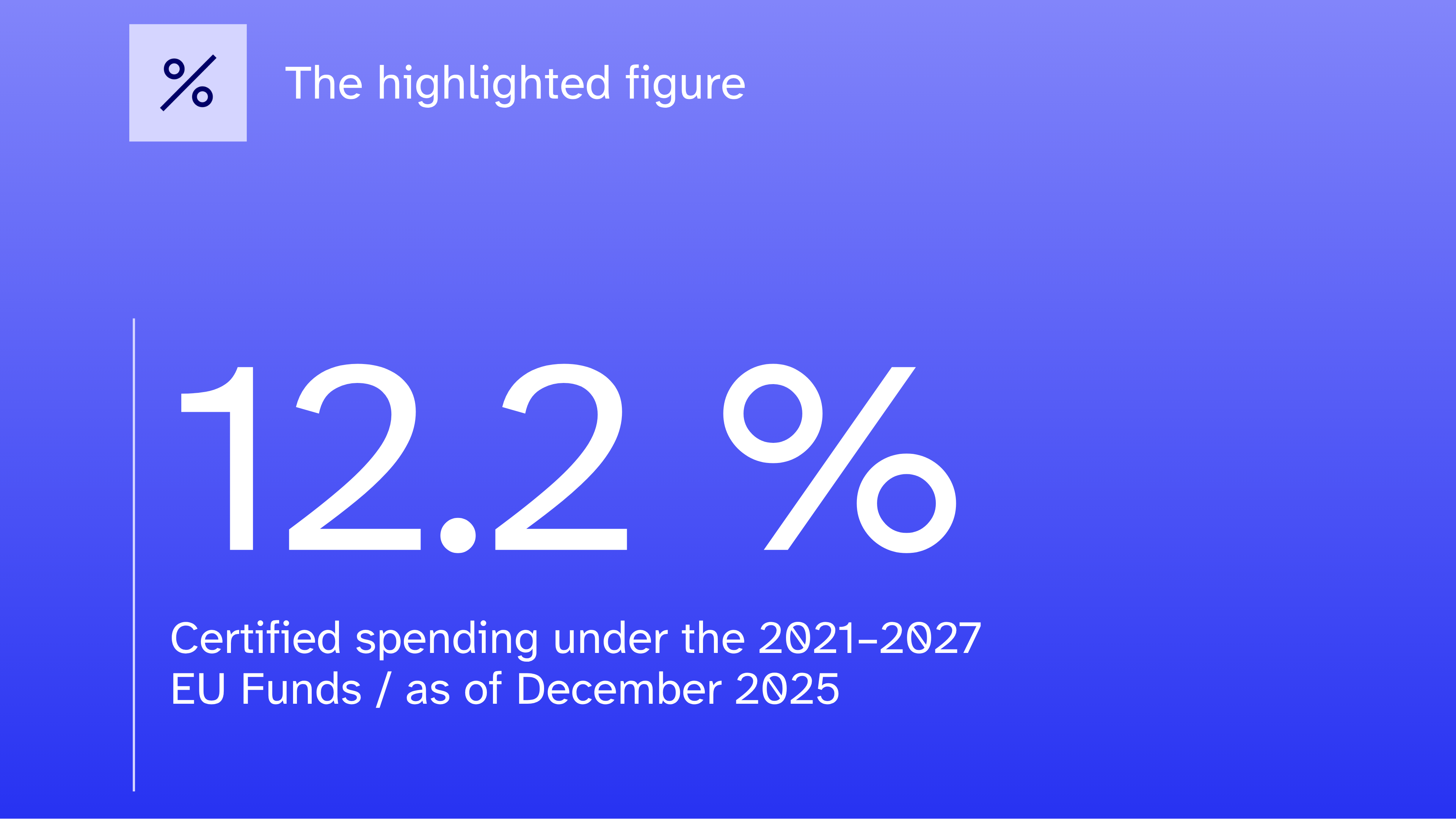
.png)


.png)
.jpg)

.png)

.png)
.png)